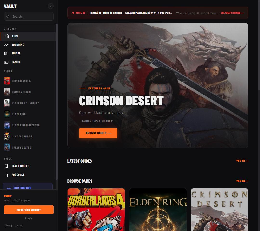
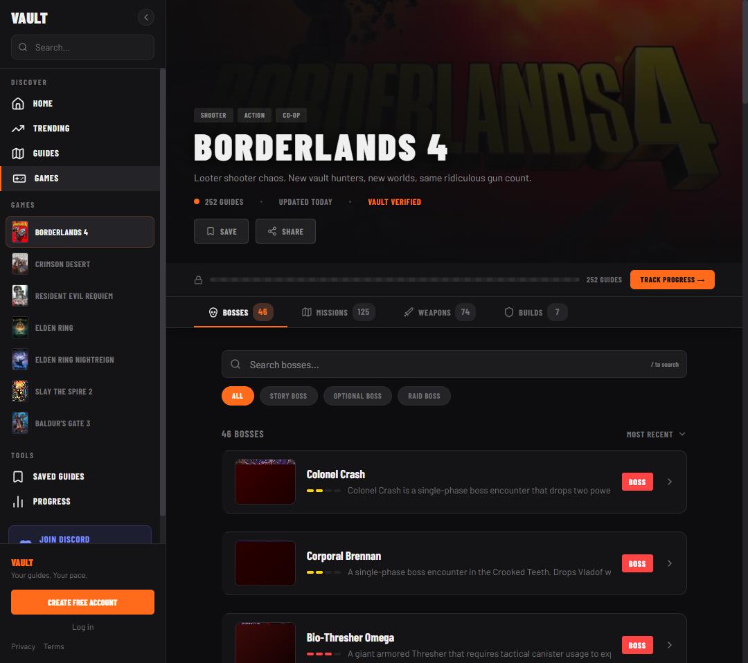
Vault is an ad-free gaming guide site (boss fights, missions, builds and weapons across Borderlands 4, Crimson Desert, Resident Evil Requiem, Elden Ring and Diablo IV) built around one idea: being stuck in a game isn’t a single state, and a guide site shouldn’t force the maximum-spoiler answer every time someone just wants a nudge.
Every guide site treats the answer as one unit: you either read it or you don’t. But being stuck in a game is a spectrum, not a binary: sometimes you want to know a mechanic exists, sometimes you want the exact numbers. Four real problems, named plainly, are the spine of what follows.
Spoilers are binary, and that’s the actual product gap
Existing sites force the maximum-spoiler option every time. You go looking for a small push and get the whole fight handed to you, and the discovery you were enjoying is gone. The unit of a guide isn’t the guide; it’s the level of detail, and the player should choose it.
Guide sites are hostile to read
Interstitials, autoplay video, cookie walls, six ad slots a screen, and 800 words of SEO preamble before the answer, while the reader is stuck, frustrated, and often on a phone next to a console. No ads isn’t a preference here; it’s the differentiator, which means the business model has to be solved some other way, or not at all.
The launch window is when guides are needed and when they don’t exist
A game ships and for two or three weeks nobody has coverage, exactly when the most players are stuck on the same handful of encounters. Traditional guide sites are staffed by writers and can’t move faster than people can play and write. Speed to publish at launch is a real advantage, and it’s an operations problem, not a design one.
Coverage is fragmented across sites with different formats
Boss guides on one site, builds on another, weapon rolls on a third, each with its own structure and quality bar: players tab between five sources for one encounter. One consistent format across guide types is worth more than depth in any single one.
Decision 1 of 3: the reversal
Progressive detail, not progressive disclosure
The first build treated hints as hidden content to unlock: collapsed accordions and blurred sections you clicked to reveal, tier by tier. It shipped, and it was wrong.
Why it was wrong: it treated hints as a reward mechanic. A player stuck on a boss doesn’t want to play a guessing game with collapsible drawers; they want direct help at exactly the level they need. There was a structural failure too: the guide read fine at “Full Guide” and was nearly useless at “None,” where it collapsed to an intro paragraph and some callouts. That isn’t a hint level, it’s a broken page.
What replaced it: the guide always shows every step. What changes is how much each step tells you: same skeleton, four resolutions, the structure of the encounter never hidden, only the specificity changing.
None
The fight changes significantly at 50% health. Figure out what triggers it and how to respond.
Nudge
At 50% he teleports to center. Something spawns that you need to deal with before focusing him again.
Bigger Hint
At 50% he teleports center and summons four clockwork minions. Kill the minions first or they’ll heal him.
Full Guide
At 50% he teleports center and spawns four clockwork minions. Kill them within 10 seconds: they heal him at 2% per second. His pattern also switches from targeted shots to a radial sweep. Stay in melee range during this phase.
Vault’s own worked example: the same boss phase, written at all four hint levels. Same fact set every time, only the specificity changes.
What it cost: every guide now needs four full versions of every section, written and stored separately. Roughly 4× the content per guide, only viable because of the pipeline described in “Under the hood” below. The disclosure version would have been a quarter of the work and a fraction of the product.
Decision 2 of 3
One control for the whole page, not a choice per section
The original design put a hint control on each section: also wrong, because it turned one decision into twelve. The moment someone reaches a guide, they’re already frustrated; that’s the worst possible time to ask them to make repeated micro-decisions.
The decision: a single segmented control at the top of the guide sets the mode for the entire page: choose Nudge once, the whole guide renders at Nudge. It persists per user, so someone who always wants full detail sets it once and never thinks about it again, and someone who plays spoiler-averse gets that respected by default.
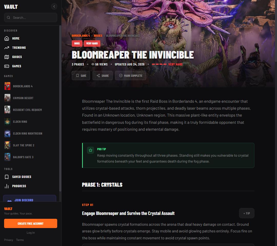
A live guide page: phased structure, an in-flow tip callout, ALL CAPS section labels reserved for UI chrome so they’re never mistaken for guide content.
Decision 3 of 3: no good answer yet
Zero ads, and what it costs
No ads, permanently, stated publicly as a brand promise, and the only thing on the list competitors can’t copy, because their entire revenue model is the thing being removed. IGN, Fandom and Game8 could build a hint system next quarter. None of them can remove their ad stack.
The honest cost, and it’s real: there is no revenue model. The site runs on hosting costs with no offsetting income, and the most obvious monetization path has been deliberately eliminated. Any future model has to be something else: a supporter tier, sponsorship, or the site staying a portfolio and community project. This is the single biggest open question about Vault, said plainly rather than omitted.
Under the hood
Vault’s real asset isn’t the site, it’s the publishing system behind it. A four-level hint system is four times the writing, which is unaffordable by hand and routine through a pipeline: the design decision above was only affordable because of the systems decision below.
01
Source scrapers
Per guide type: bosses, missions, builds via a real headless browser, weapon rolls, YouTube companion content.
→
02
Fact extraction
An LLM pass pulls structured facts from prose: phases, triggers, thresholds, resistances, drop rates.
→
03
Guide writing
A second pass, per-type prompts, writes all four hint levels in Vault’s voice from the extracted facts.
→
04
Export
Finished guides write to the database, ready to serve.
→
05
Live
Thumbnails assigned, guide published, during a game’s launch window, when demand is highest.
The honest tension: the guides are AI-assisted, built from scraped public sources and fact-checked against game data. That raises a real quality-and-trust question, and the answer isn’t “AI is fine”; it’s that the pipeline extracts facts from human-authored sources rather than generating claims, and quality control is a per-guide review problem that scales worse than the writing does.
A worthwhile debugging story from the same system: the sticky hint bar silently stopped sticking, and the actual cause turned out to be three layers away from the symptom: a scroll setting on a completely different element than the one that visibly broke. It turns out to matter more than it looked at the time (see “desktop-first” under Impact, below).
Distribution: the real bottleneck
Launch was a single post to r/Borderlands4: 134 upvotes, 12,000 views. What actually worked wasn’t promotion, it was answering people’s real questions in threads first and mentioning the guide only as a follow-up: earn the moment of use before asking for anything back.
The bigger lesson was a positioning call, not a design one: pick a game by competition, not popularity. A new game with a small, hungry community and no coverage yet is a better bet than a huge one where a solo project is invisible against sites with years of head start.
The honest conclusion: the product is good. Distribution is the constraint, not quality: a solo builder can produce a better guide experience than IGN and still lose on reach. That’s worth saying plainly rather than implying the site’s a hit it isn’t yet.
The visual system
Dark theme only, not a toggle: the reading context is a dim room next to a TV. One accent, used only for the active hint level, badges and primary actions, so it always reads as the interactive element on the page. ALL CAPS for section labels and badges, sentence case for content, so interface chrome never gets mistaken for guide text. Semantic colors are reserved and never decorative: a red callout always means “this will kill you.” Callout rhythm is an authoring rule, not a styling fix: one to two callouts per phase, never adjacent; callouts are interruptions to the flow, and if they are the flow, they’ve stopped meaning anything.
Accent: active hint level, badges, primary actions
Success: reserved, semantic only
Warning: reserved, exact value pending
Danger: reserved, exact value pending
Impact, in detail
Google Analytics and Search Console, Jan 1 – Aug 25, 2026. Real pull, not a snapshot picked to flatter: site-wide CTR and average position are ordinary for a young, thin-coverage site; the interesting signal is in the findings below, not the headline row.
4,900users
11Kpage views
5,800sessions
26savg engagement time
51.4KSearch Console impressions
862clicks (1.68% CTR)
11.67average search position
252guides published
Acquisition: Direct 3,400 · Organic Search 1,300 · AI Assistant 114 · Organic Social 64 · Referral 16. 539 landing pages answering 2,287 distinct queries.
Device split
The design assumed phone-first. The real split says otherwise: see “desktop-first” below.
Desktop60.1%
Mobile39.5%
Tablet0.4%
CTR by guide, same content register vs. lore register
Sorted by CTR, normalized to the strongest performer. Burhum and Areciel are titled the way people search; the bottom four are titled the way the wiki would.
Burhum Maze7.96% · pos 6.38
Areciel: Witch of Strength6.02% · pos 6.22
Smoking Lands Desert Mouth3.59% · pos 8.48
Lyselia: Witch of Humility3.56% · pos 7.28
Bari: Witch of Kindness2.60% · pos 7.60
Elowen: Witch of Wisdom2.09% · pos 7.28
252 guides across bosses, missions, weapons and builds, one consistent format per game.
What the data said
Three findings out of the pull above, picked because each one changes what gets built or written next: not a full analytics readout.
What the data said: 1 of 3, a measurable finding
Titles should be the query, not the entity’s formal name
Burhum Maze converts at 7.96% CTR from an average position of 6.38. Elowen: Witch of Wisdom location converts at 2.09% from a better position, 7.28. Position doesn’t explain a 4× gap. The title does. The winners match how people actually type (the top queries behind them are “burhum puzzle,” “smoking lands puzzle,” “areciel”); the losers are titled in lore register: “Elowen, Witch of Wisdom, location”, when the real search was “crimson desert elowen.” Lead with the search term, drop the epithet, use the verb people used. (See the chart above, “Impact, in detail.”)
The honest caveat: the site-wide 1.68% CTR is not evidence of broken titles: at an average position of 11.67 that’s roughly normal. This finding only holds for the pages already ranking 6–8, where CTR still varies 4× at the same position.
What the data said: 2 of 3, an open question
Instrument before deciding anything else about the hint system
26 seconds of average engagement and 0.38 engaged sessions per user reads two opposite ways: people find their answer fast and leave (the product working exactly as intended for someone mid-game) or they aren’t finding it. The data as it stands can’t tell those apart, and every future decision about the core feature depends on knowing which.
The fix: add analytics events that record which hint level someone picks and whether they escalate to a deeper one, plus scroll depth per tier. This is the highest-value build on the roadmap right now (higher than any new game, any new guide type) because it’s the one piece of missing information that every other product decision about the hint system is currently a guess without.
What the data said: 3 of 3, an assumption proven wrong
Desktop-first for the hint control
The design assumed phone-first: someone stuck mid-game, one hand free, next to a console. The real split is 60.1% desktop, 39.5% mobile (see the device-split chart above). Desktop use here reads as second-monitor, alt-tabbed-out-of-the-game use: a different posture, with longer sessions and more scrolling than the phone-first assumption was designed around.
That retroactively makes the sticky-hint-bar bug from “Under the hood” more consequential than it looked at the time: the segmented control’s position matters more on desktop than assumed, not less. Worth revisiting whether it needs a persistent, compact state on desktop rather than the same treatment mobile gets.
What’s next
The hint-instrumentation build above is first: every other product decision on the core feature is downstream of it. Coverage keeps expanding by the same competition-over-popularity logic that picked Borderlands 4 first, concentrated rather than spread thin, per the same data. And the open question from Decision 3 stays open: some version of a supporter tier or sponsorship is the most likely path, evaluated against the same zero-ads promise that makes the site worth building in the first place.
Copia’s headline moment was removing a quantity number after watching someone shop. Vault’s is rewriting the hint system after realizing it was a reward mechanic instead of a help mechanic; and, per the data above, possibly about to be rewritten again once instrumentation says which. Same instinct, different domain.